I've been playing a lot of Civ V lately, which should come as no surprise to anyone. Anyone with even a passing interest in strategy games should give it a try; it's an interesting, albeit very safe, take on a well-established formula. What I like most about it, though, is the changes to the interface -- in previous iterations of the series large empires grew completely unmanageable in the endgame. Just hunting down all the cities and units that needed new orders in a given turn starts to feel a bit like work.
In V, they've introduced a nice interface element that greatly simplifies all of this management: at the beginning of each turn, a queue of icons appears, each representing some action or decision you should probably take during this turn. You can ignore them, of course -- but it's incredibly helpful to have the game tell you when, say, you need to pick a new tech to research or a unit is waiting for orders. It's not an original mechanic, by any means -- but it's incredibly helpful here.

Naturally, I've stolen it for Distant Star.
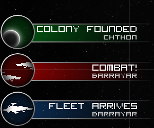
At the beginning of each turn in Distant Star you get a neat little stack of notifications along the left side of the screen. If something interesting has happened -- a ship was completed, a fleet arrived at its destination, a colony was founded or lost -- an icon appears to let you know about it and, if you tap it, give you more information. I'm finding that it completely changes the way I play, making the game feel like less of a chore. On each turn I scan through the notifications with my right hand, tapping any that I think need my immediate attention. With my left hand I take care of whatever needs doing, whether it be giving new orders to a fleet or queuing up another batch of frigates on an idle system. It's deliriously intuitive, at least to me -- and it completely does away with the tedious scrolling that characterized the game up until now.
![[Expat Games logo]](http://expatgames.net/styles/expat/header_big.png)
Leave a comment